Colour Palette Portfolio
Aesthetically colour has always played a hugely important role within the conceptual work that I produce, however it’s only recently that the results of this colour management has caused me to step back and take stock of the work in my portfolio and look closer at why certain images sometimes work better than others.
The use of color in any medium, photography, film, graphic design, or art cannot be free of meaning, whether intended or attributed by others. This use of colour can affect us in many ways, often subconsciously without us even being aware, helping us convey feelings of emotion in telling our visual story to the viewer.
I’ve learned when working on a project that the choice of colour palette is such an important consideration, this knowledge of colour theory allows us as creative artists to control, manipulate meaning, add tension, atmosphere and help give an overall feeling which we may want to portray within the artwork, photograph or film, allowing the colour in our work to help provide that powerful and beautiful edge we desire.
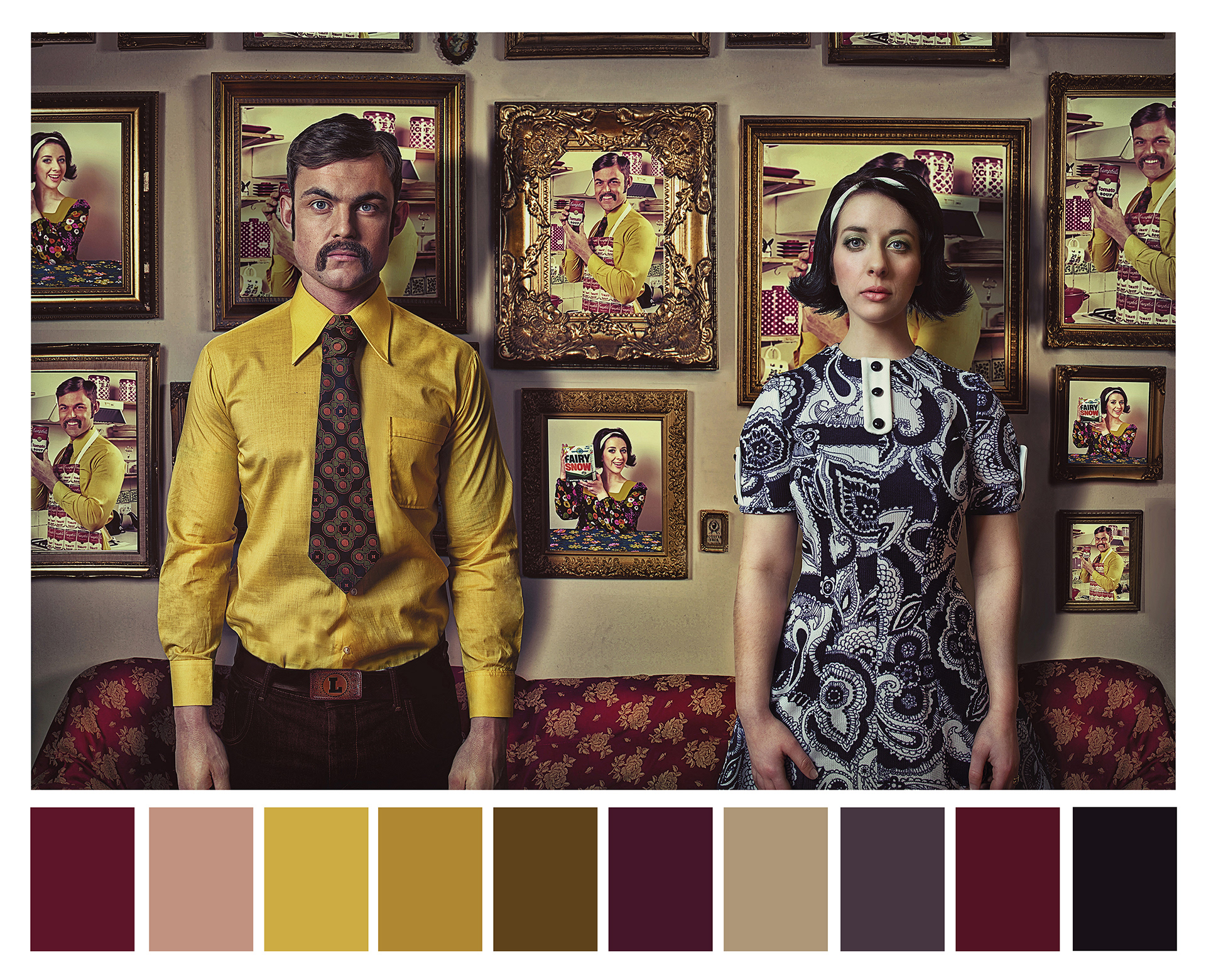
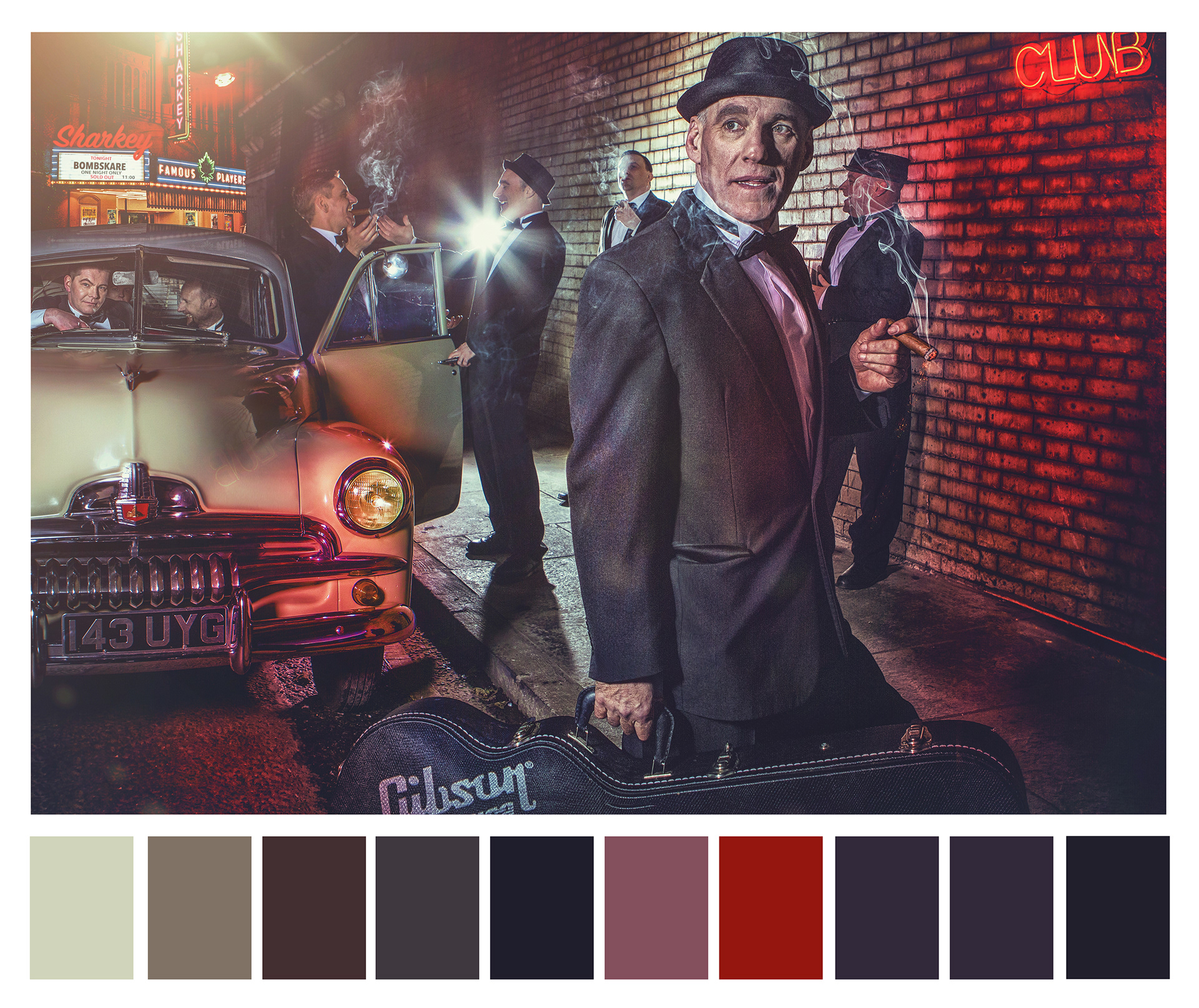
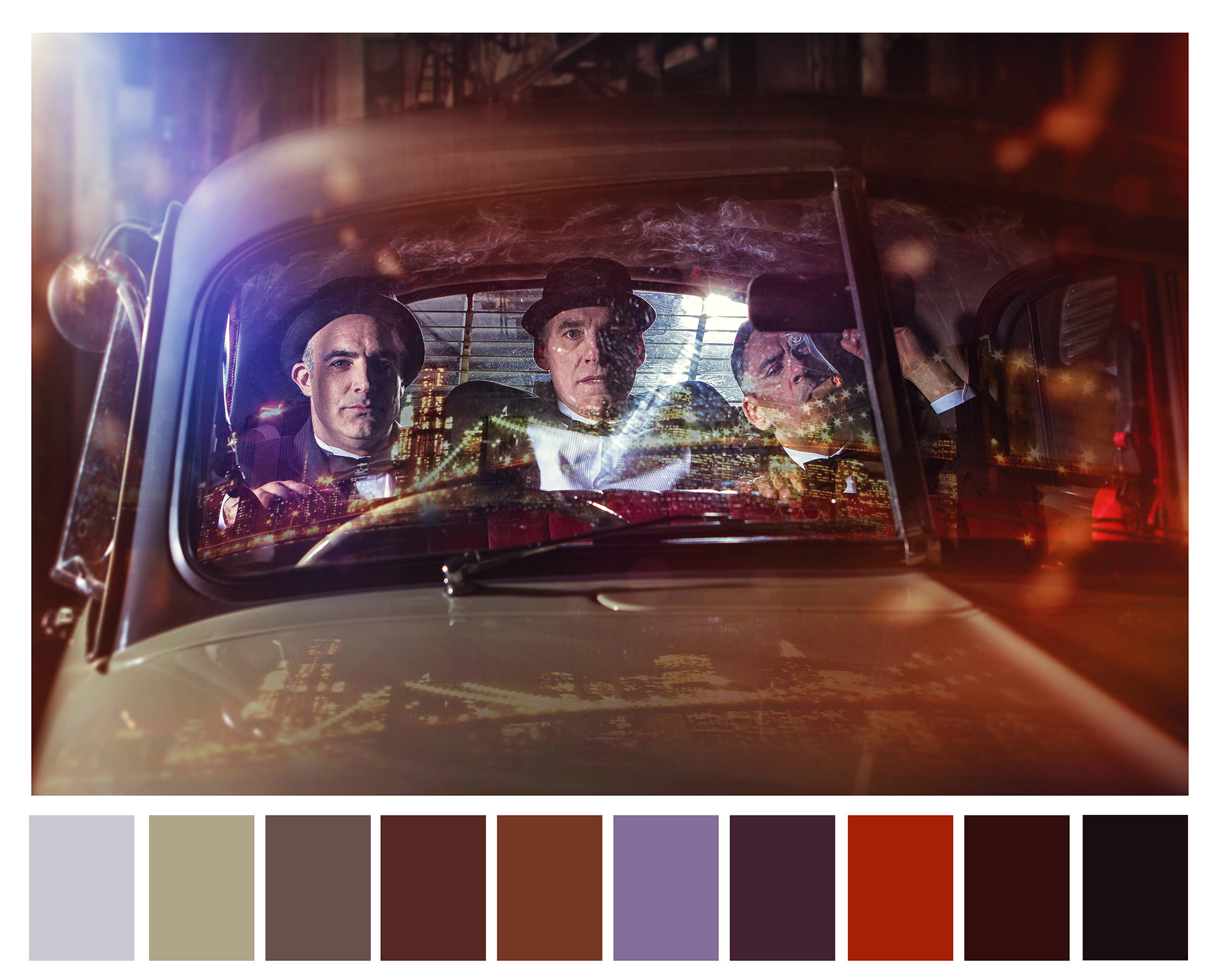
Specific colours can be distinctly associated with particular locations and places, or help give a sense of time or period, for instance imagery from the 60s and 70s tend to have more orange, yellow, and brown tones, and warmer and richer colours overall. So for my photographic series ‘False Advertising,’ a palette consisting of these specific colour combinations was used to help place this series in a specific time period.
Deliberate contrasts of complementing colours, or the use of select colour palettes are used in digital colour grading of both moving film and in stills photography to amazing effect, assisting the artist to achieve the desired effect, from the strong desire for consistency throughout a specific film or photographic series or alternatively used in certain parts to seek added visual attention from the viewer.
Colour can have political, religious and cultural connotations, represent gender and as believed by Kandisnky, have an emotional and physical effect on us. Colour can supposedly improve our memory, influence buying decisions, indicate meaning and importantly for me help tell stories.
It is this use of colour to help tell a visual story within my work that provides me with the tool I need to bring my imagery to life, because pretty much all of the photographic artworks I produce are works of fiction, photographing imagery that plays with our preconceptions of what we imagine something to look like, rather than photographing the actual thing itself and then adding that important element of romantic escapism.
So it was with this in mind that I decided, with the help of Adobe Color, to take a look at which colour palettes I was using and to what effect, allowing me to then better use this knowledge in the production of my work moving forward.
Once you start to see life around you in series of complementing colour palettes, looking for and finding new and exciting colour combinations to use, it helps make you more aware of colour within your surroundings, which in turn now allows me to use colour to better effect, both in my single frame stills photography and within my digital retouching and composite work.
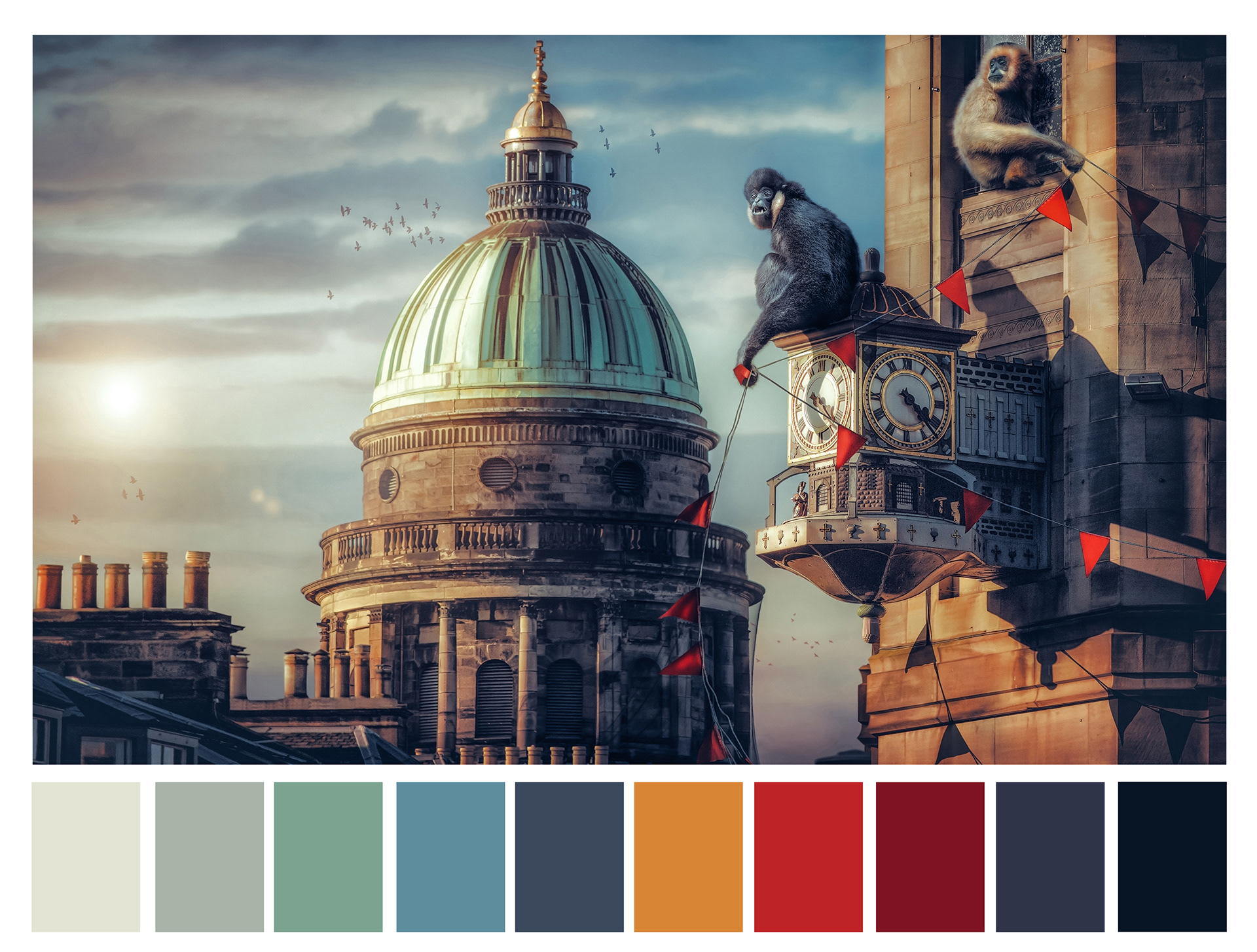
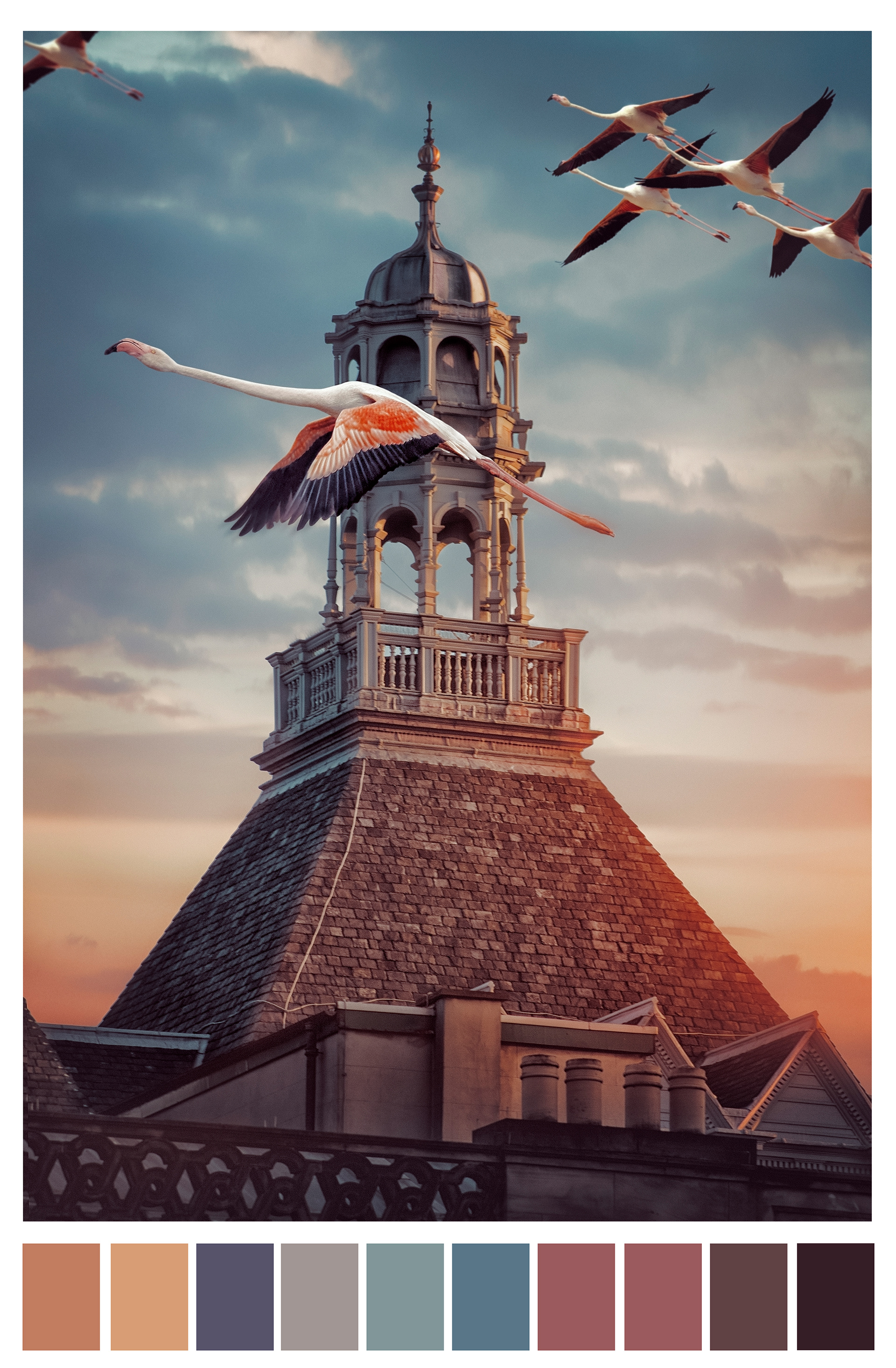
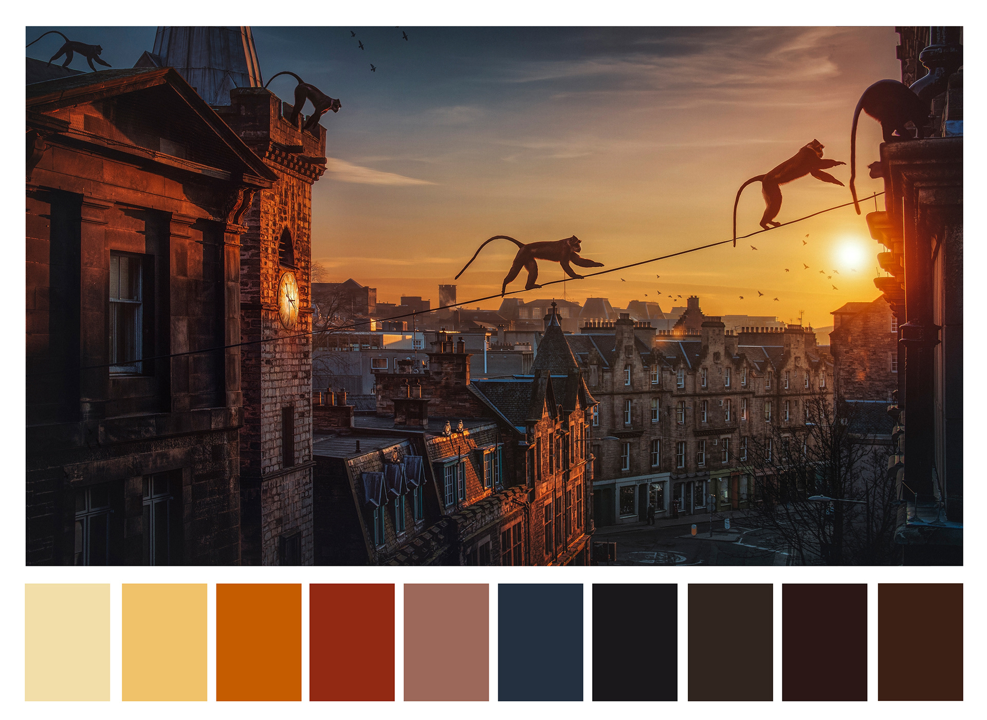
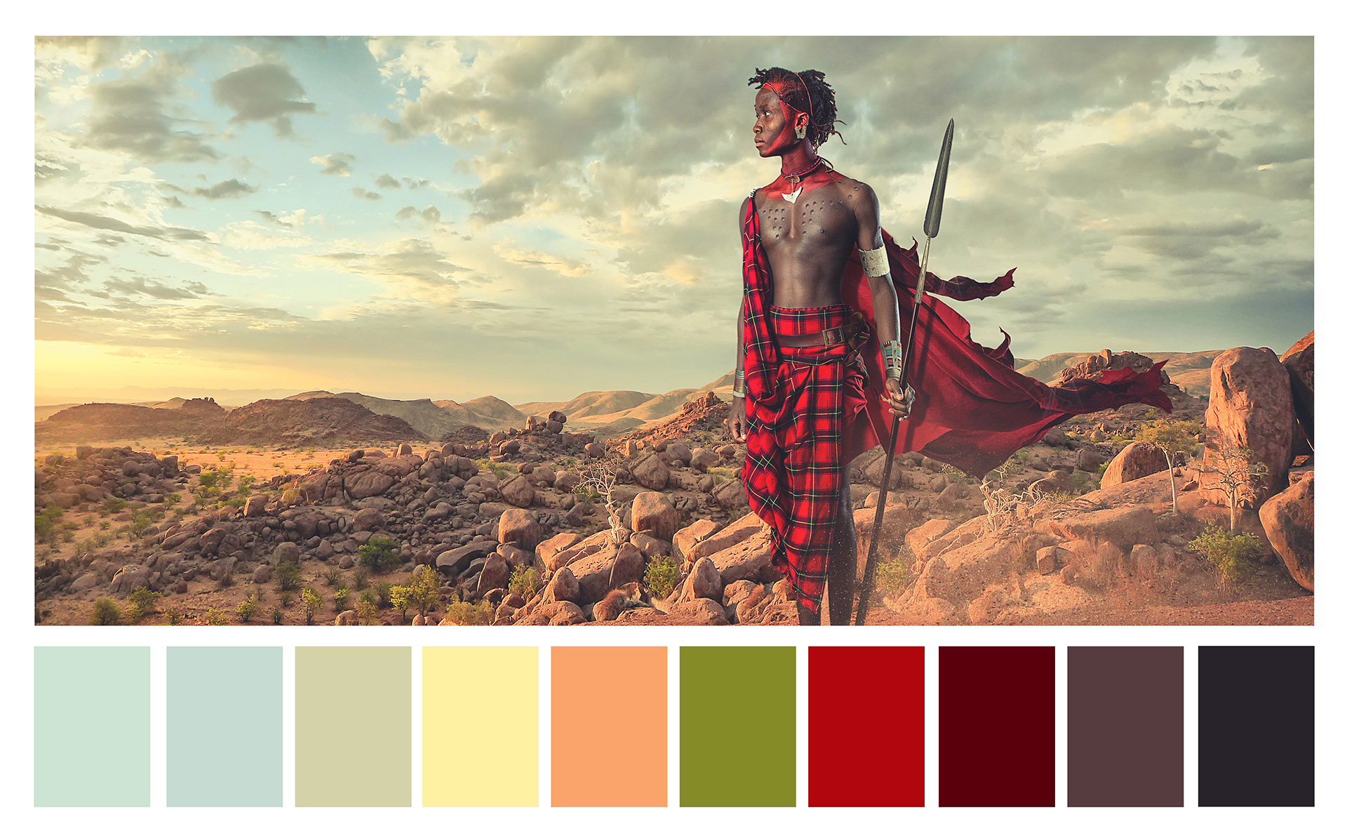
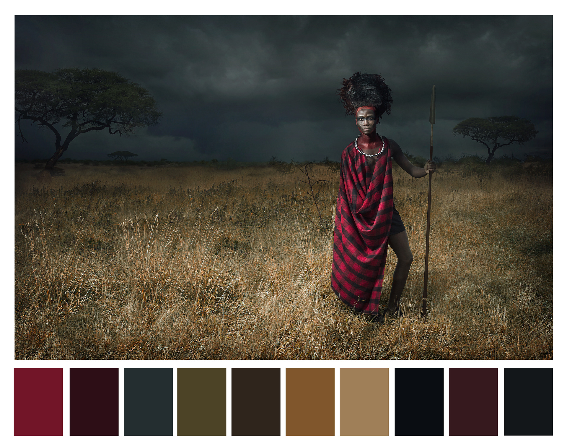
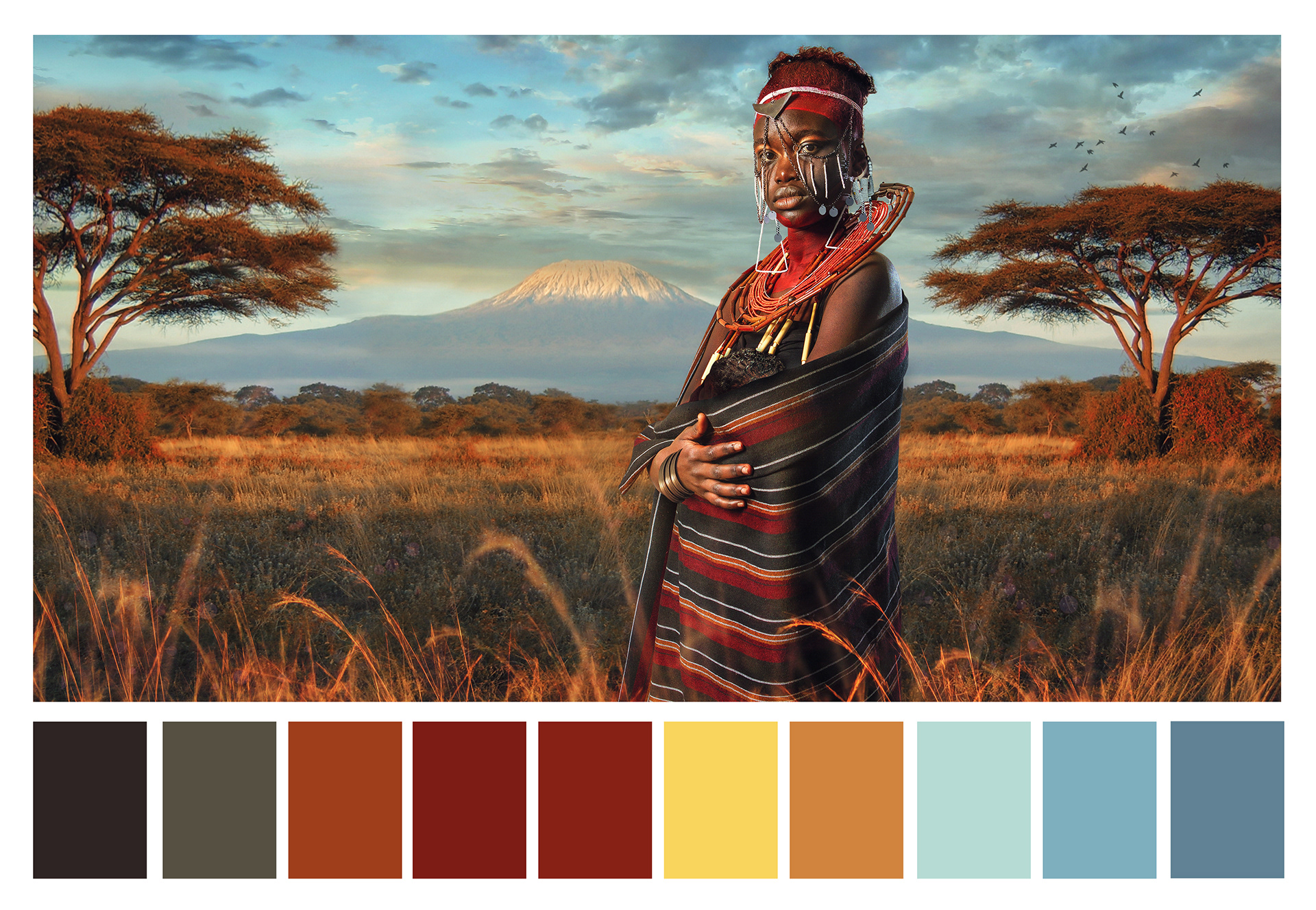
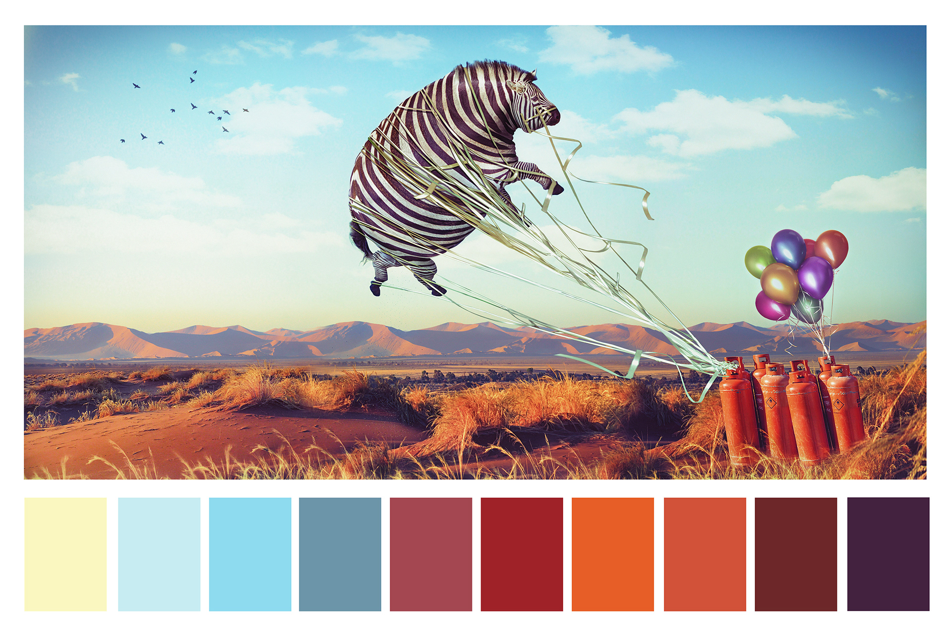
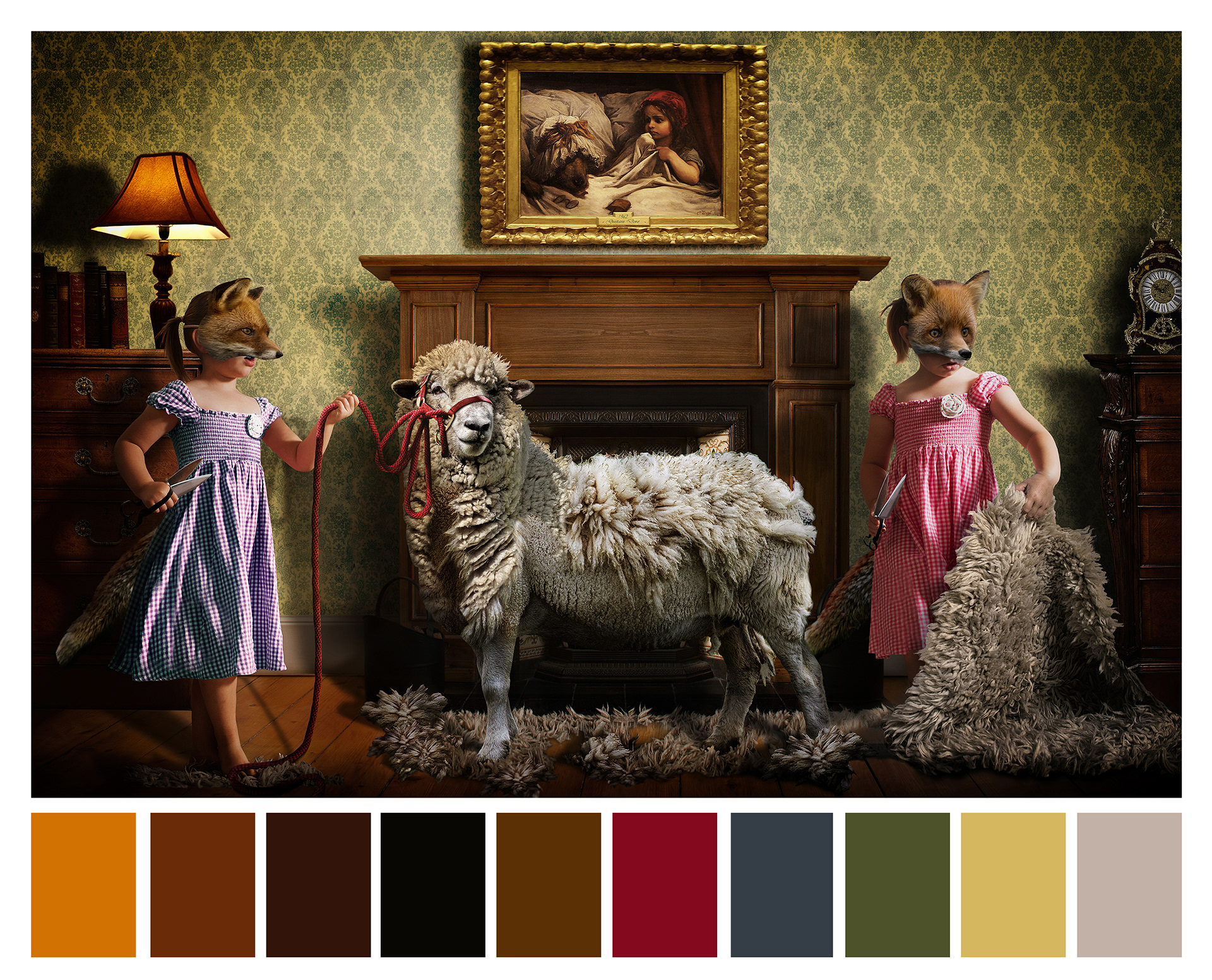
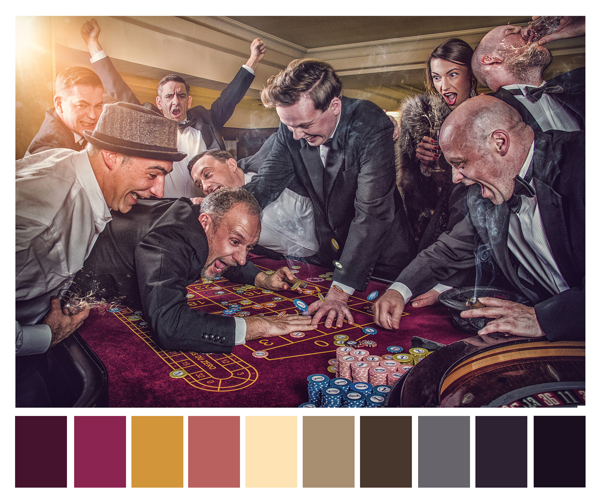
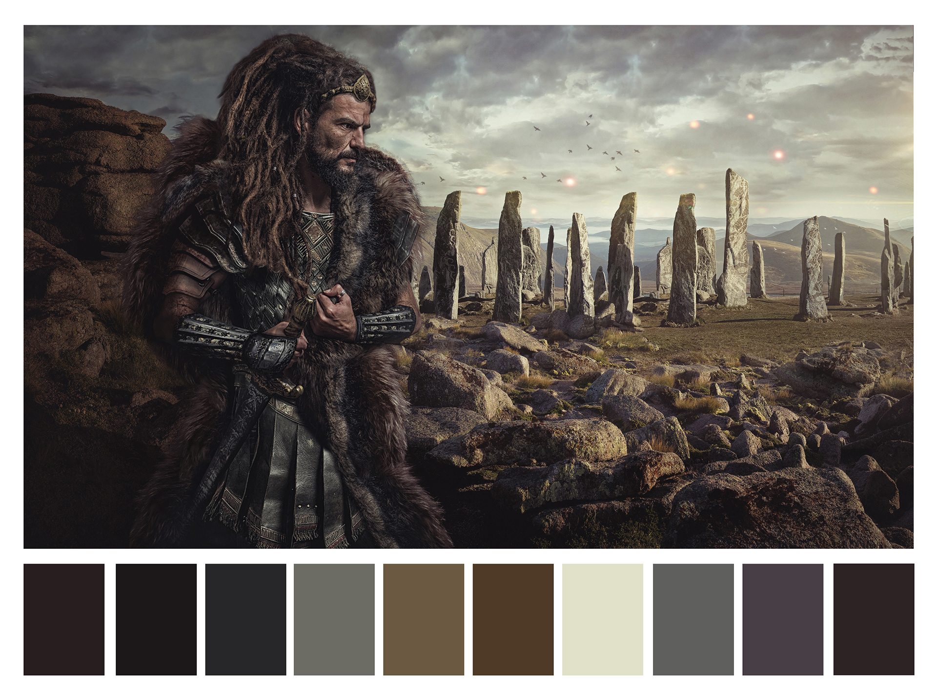
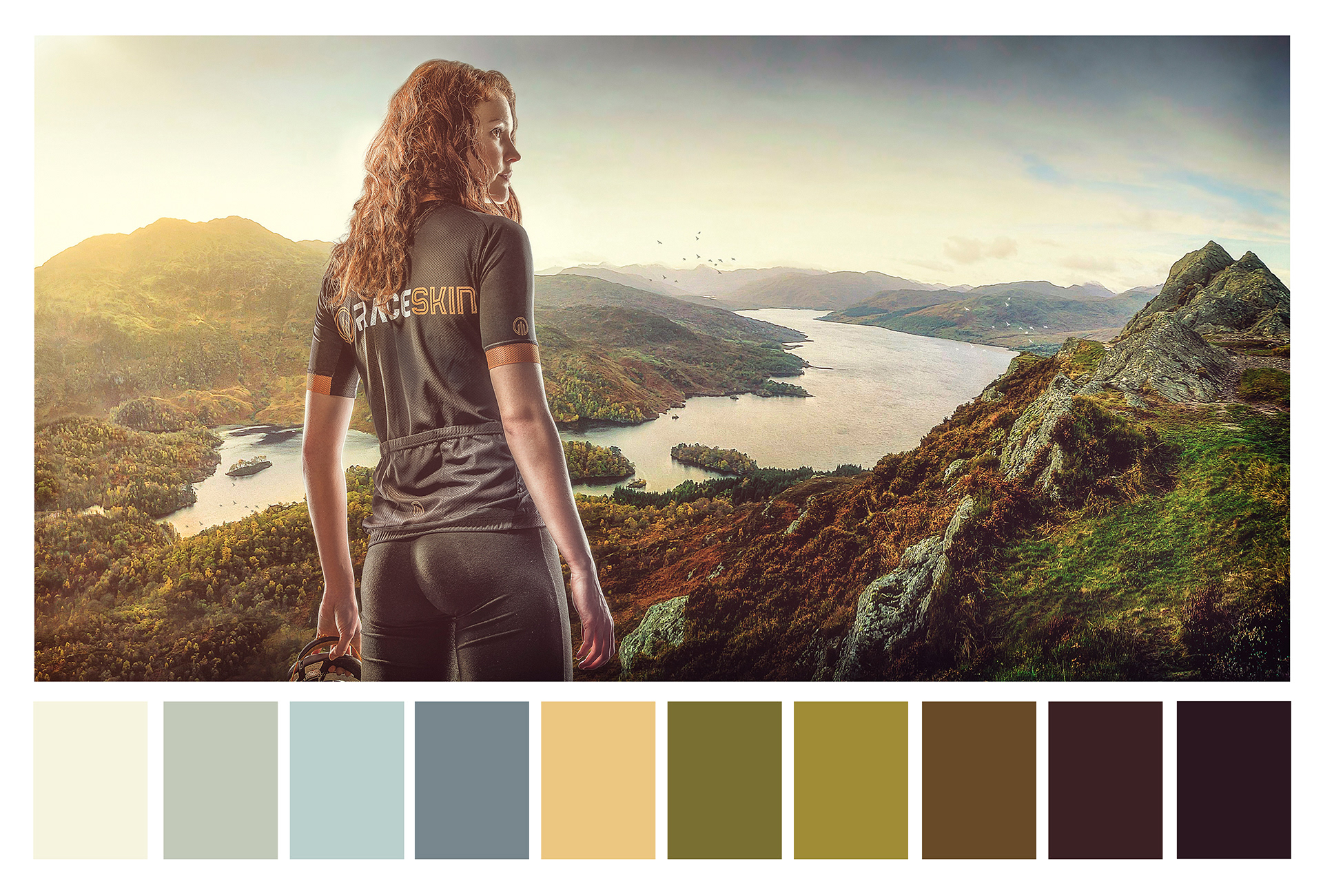
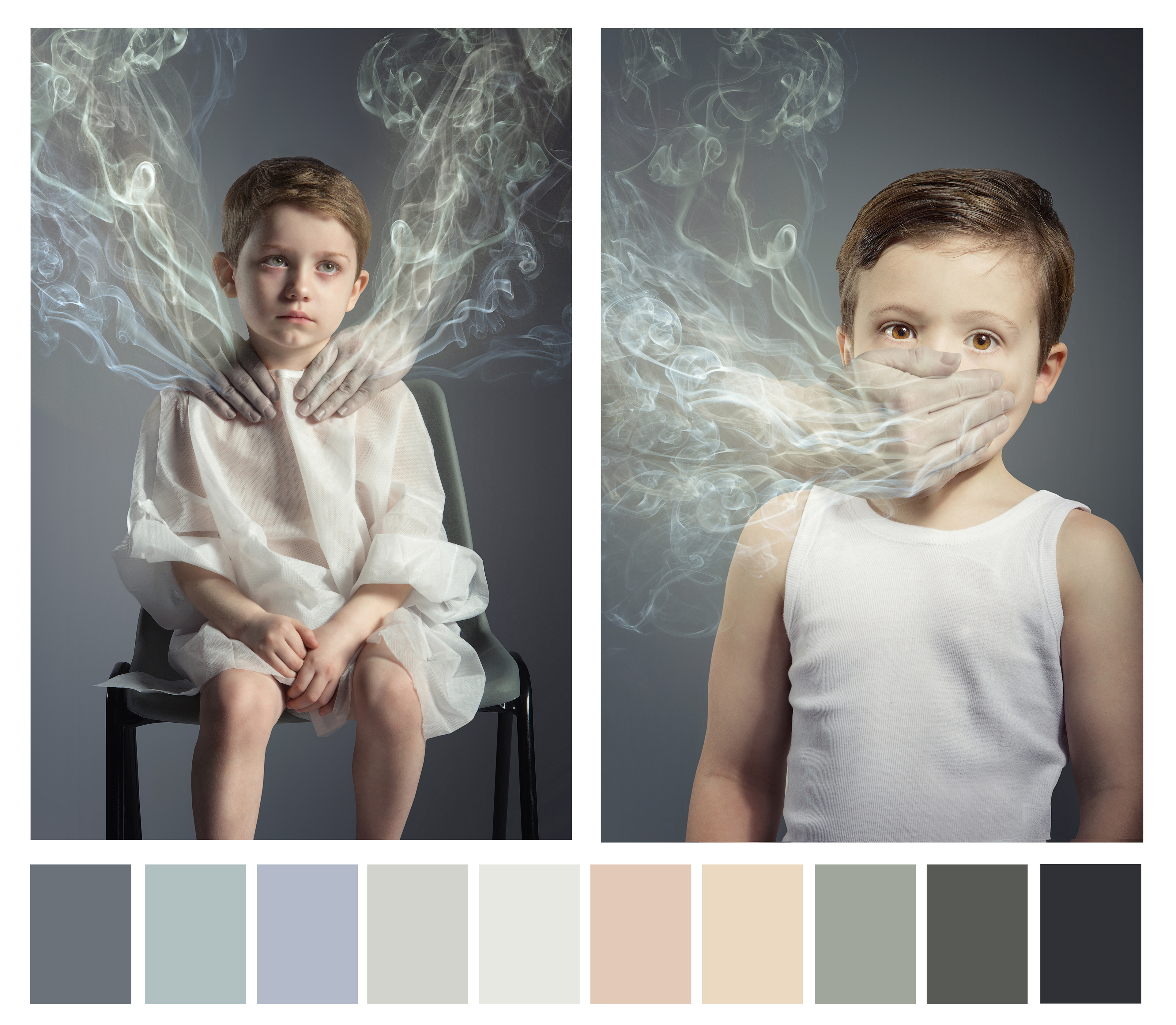
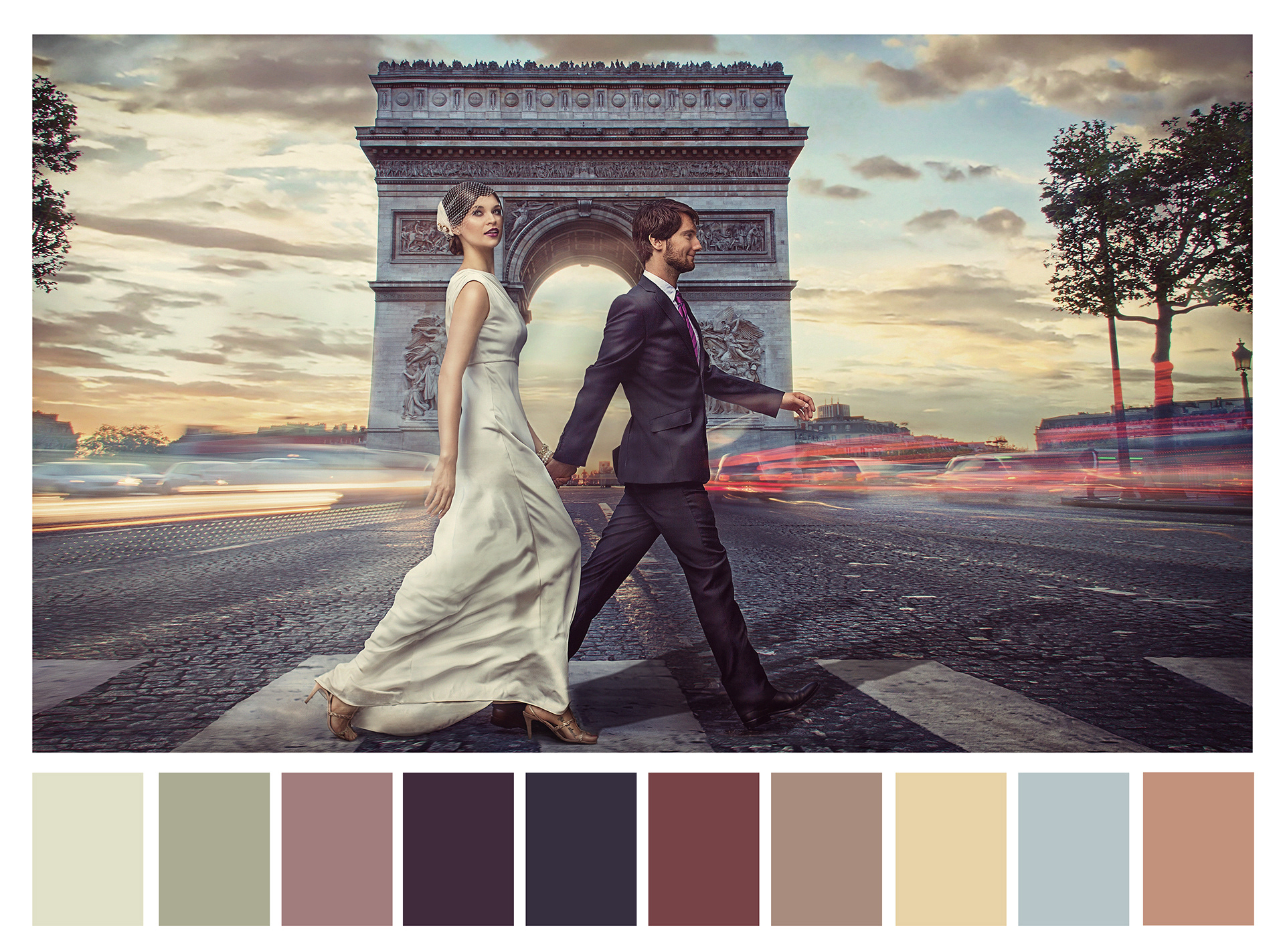
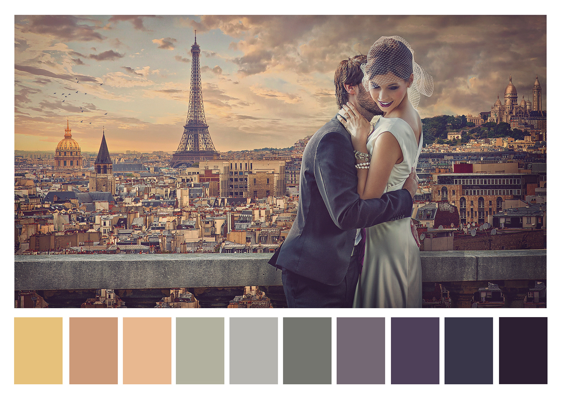
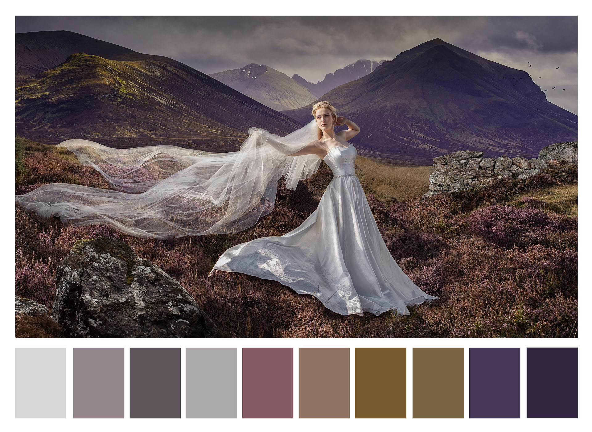
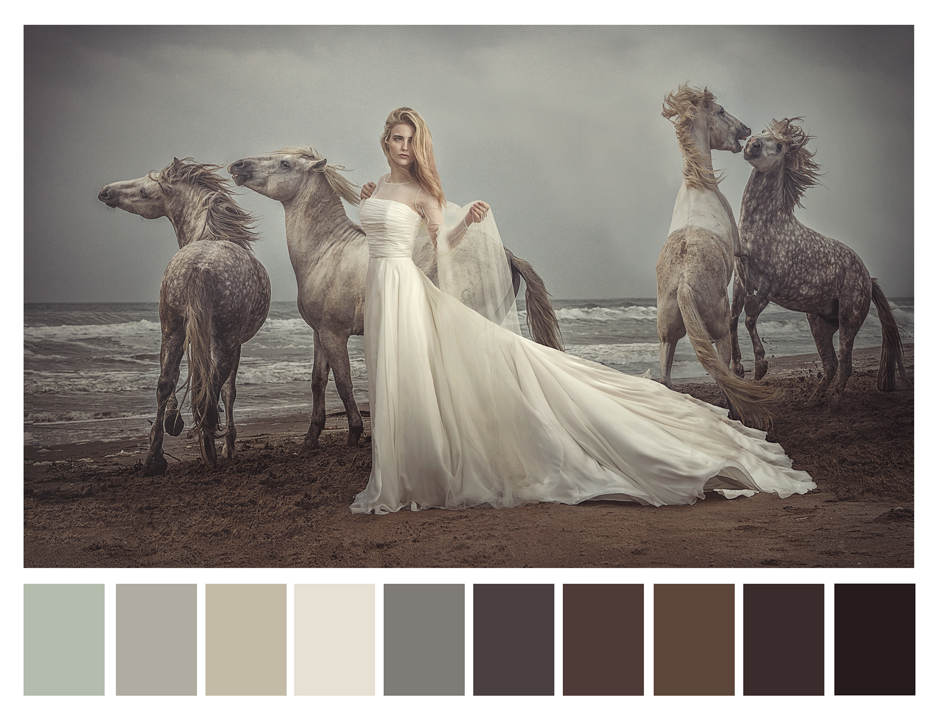
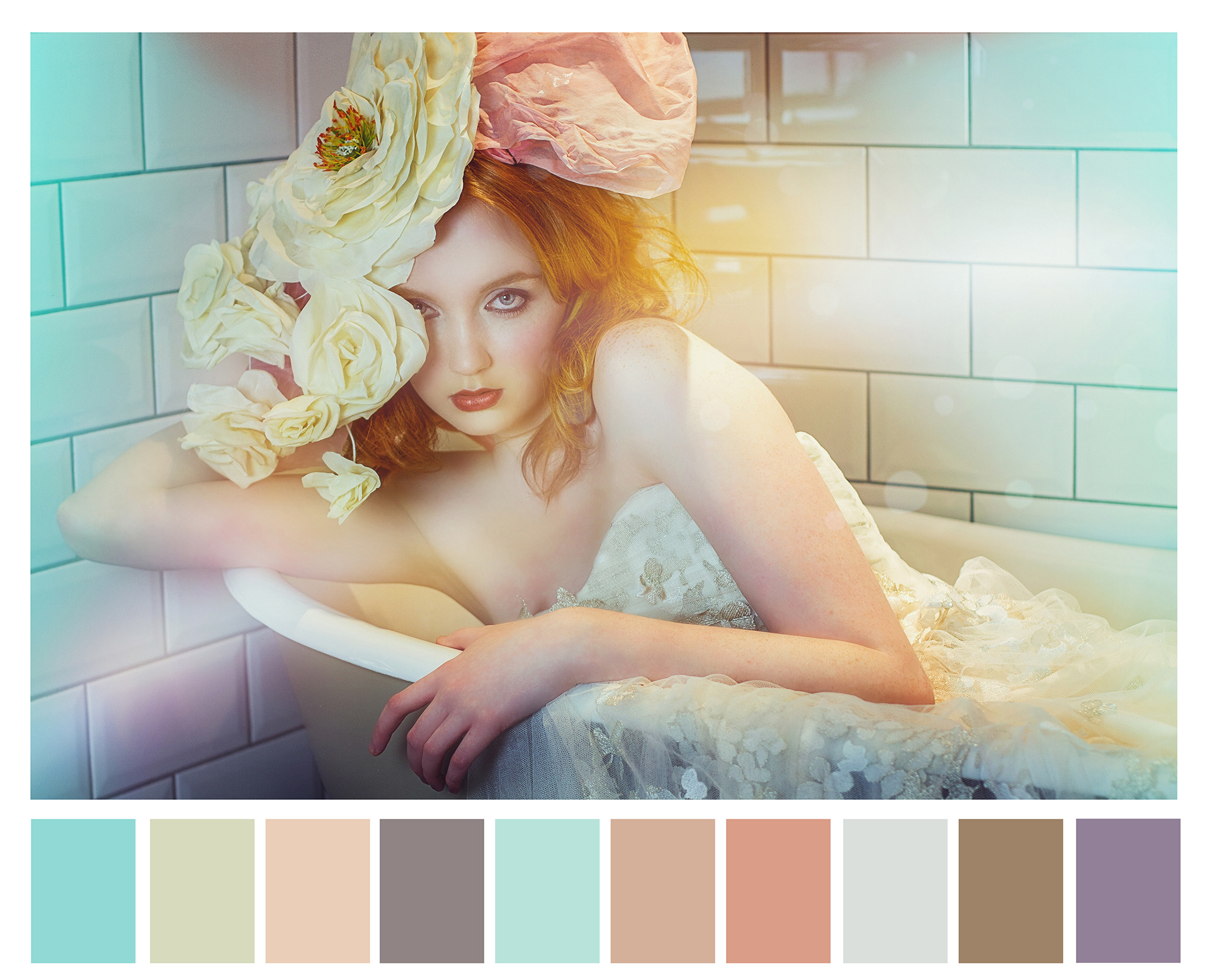
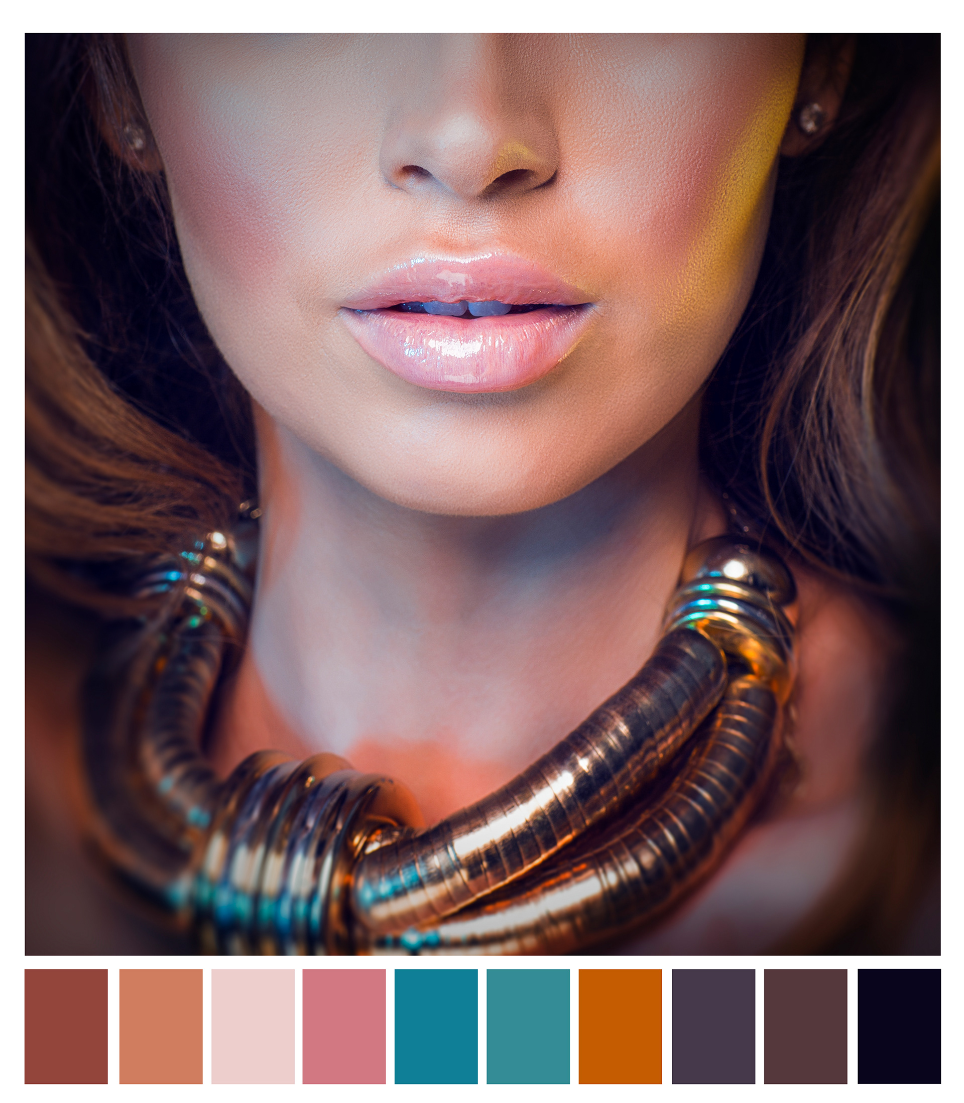
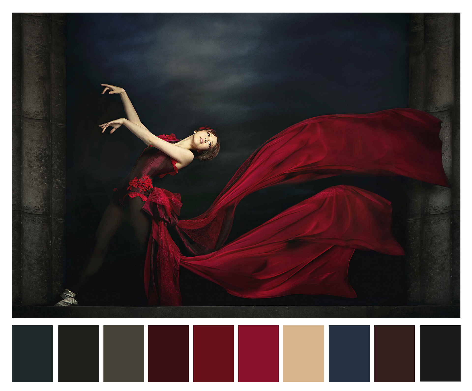
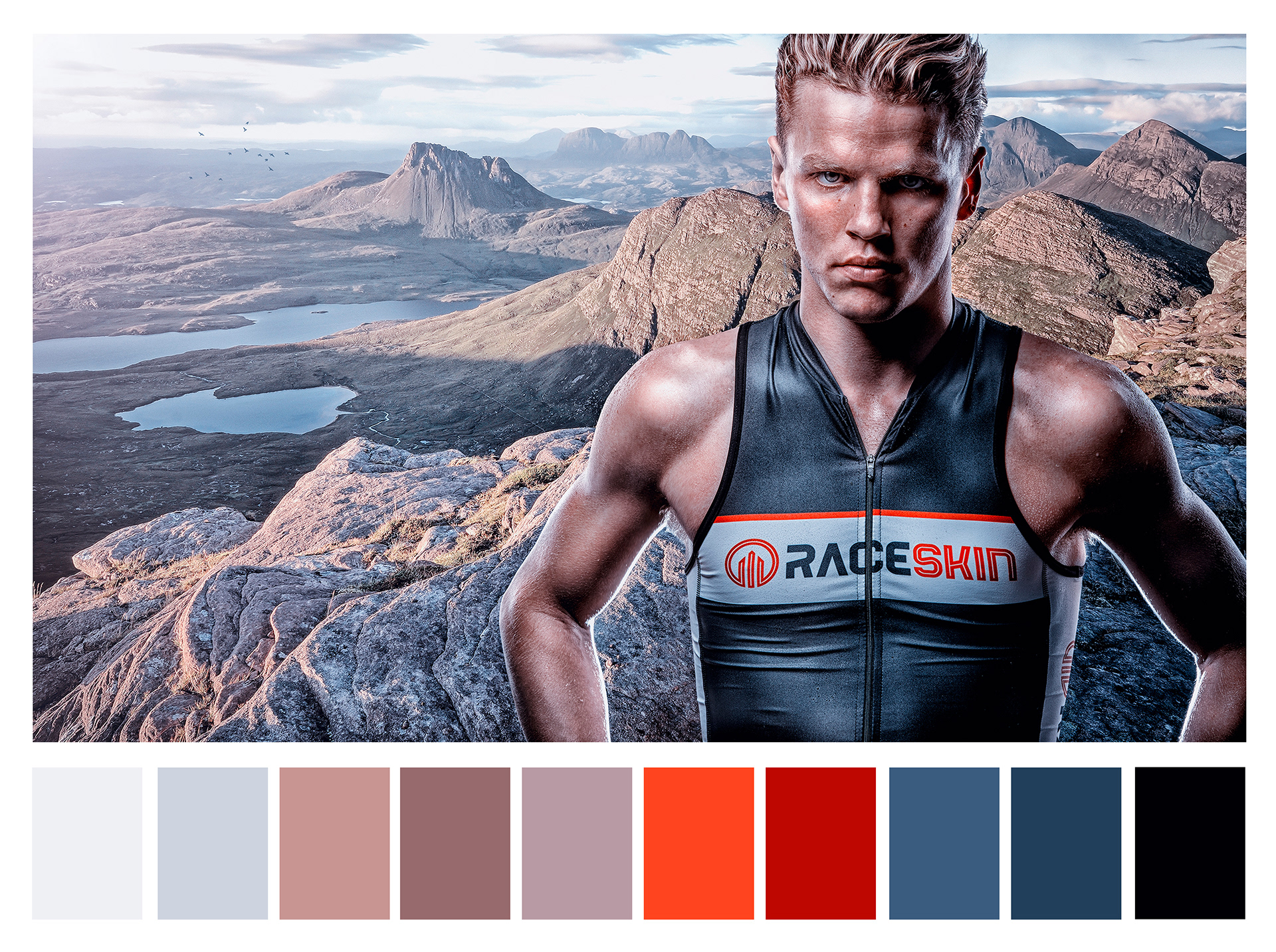
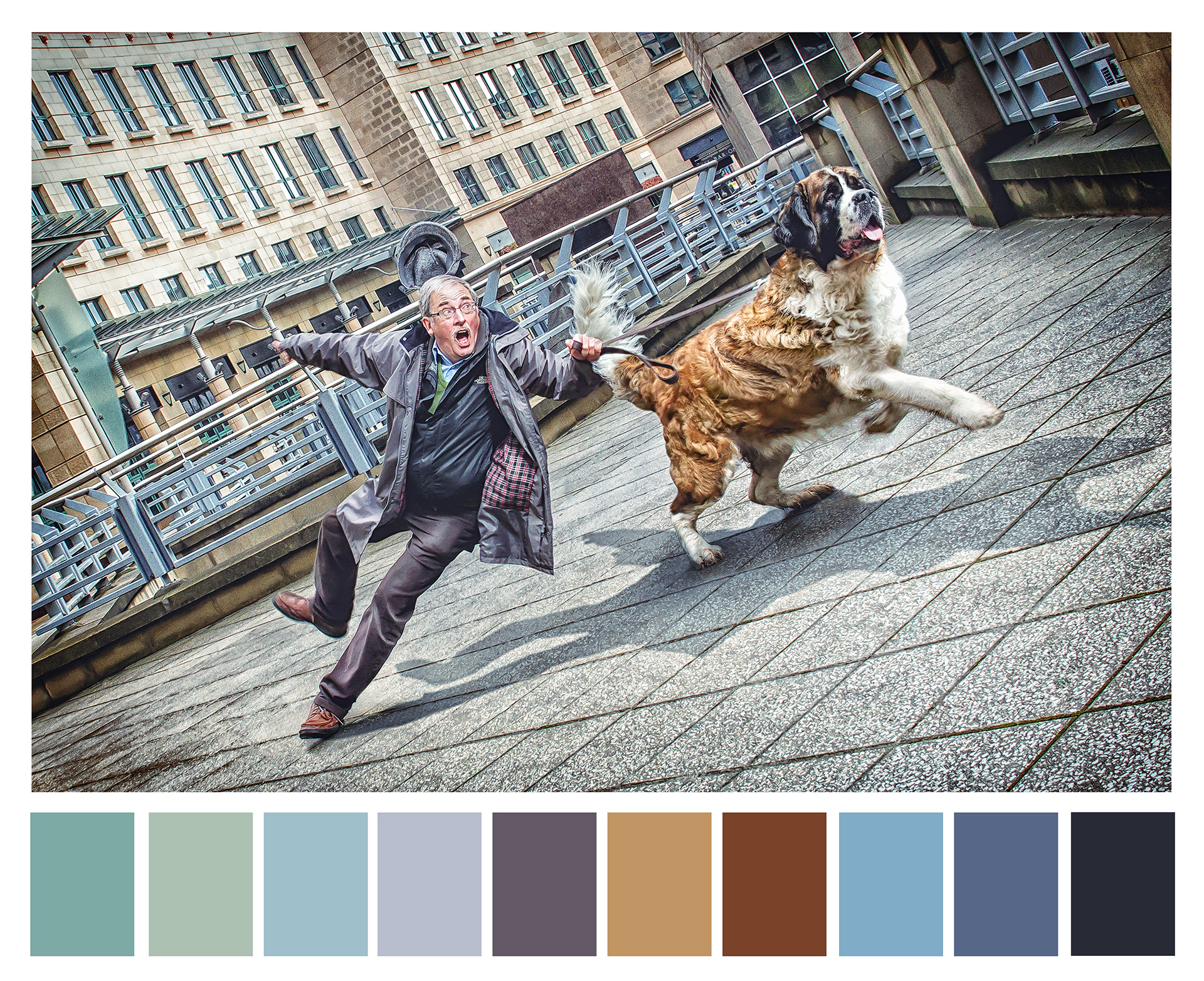
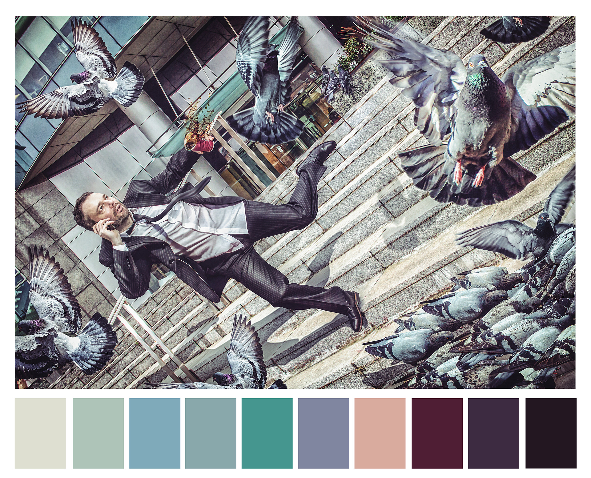
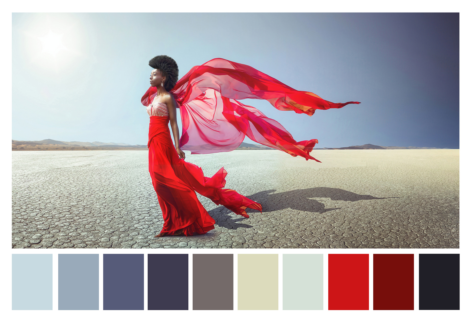
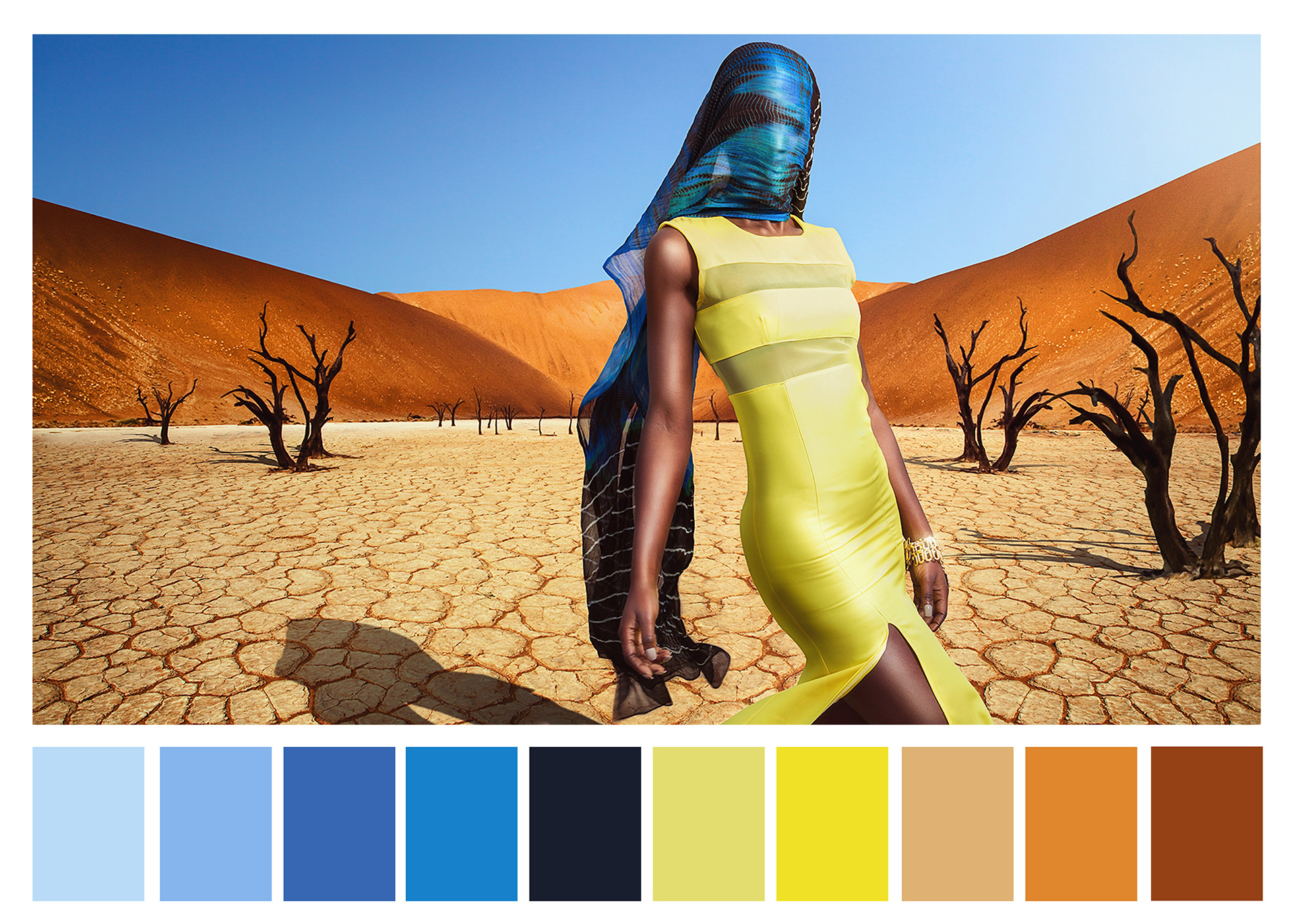
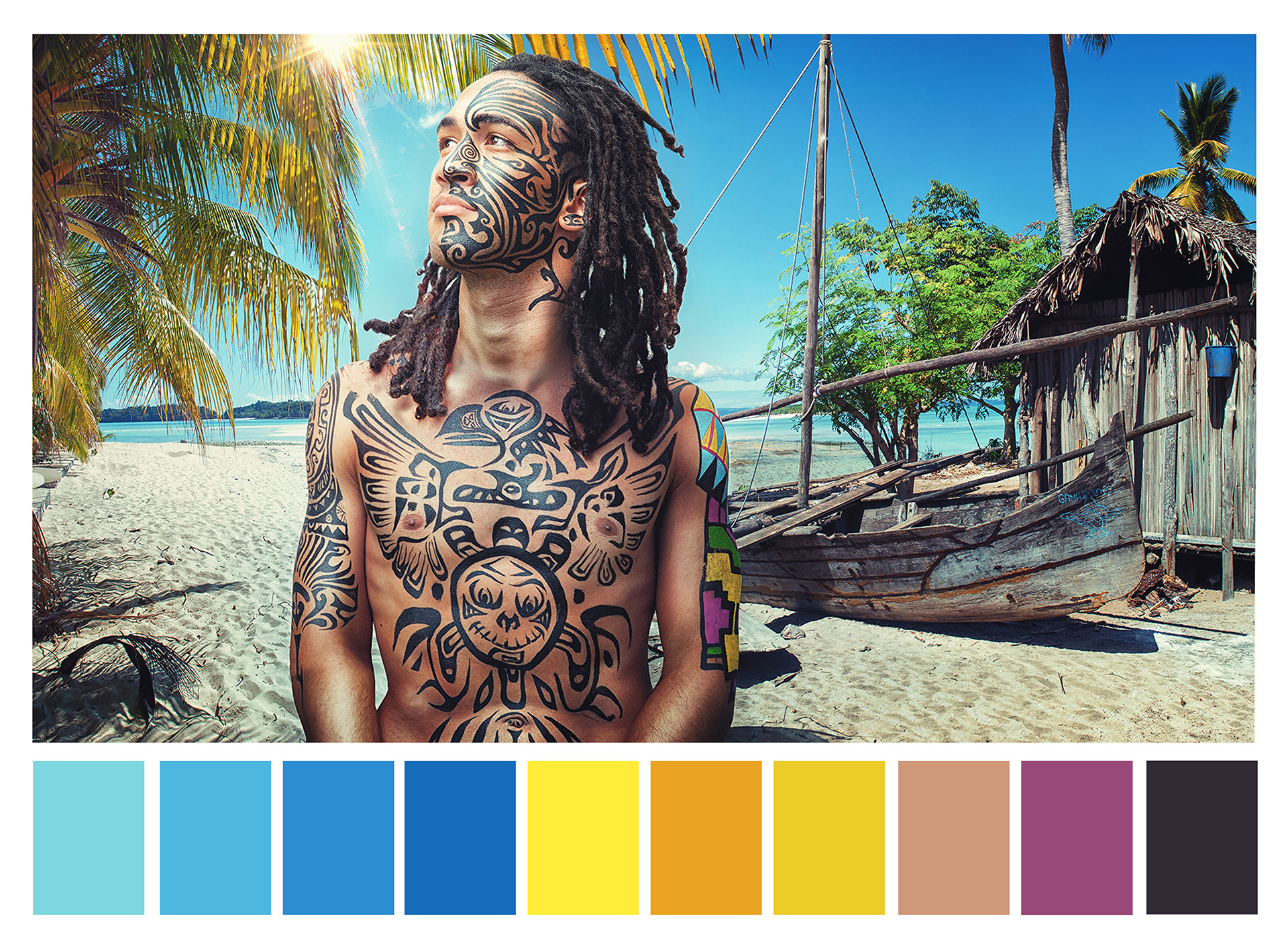
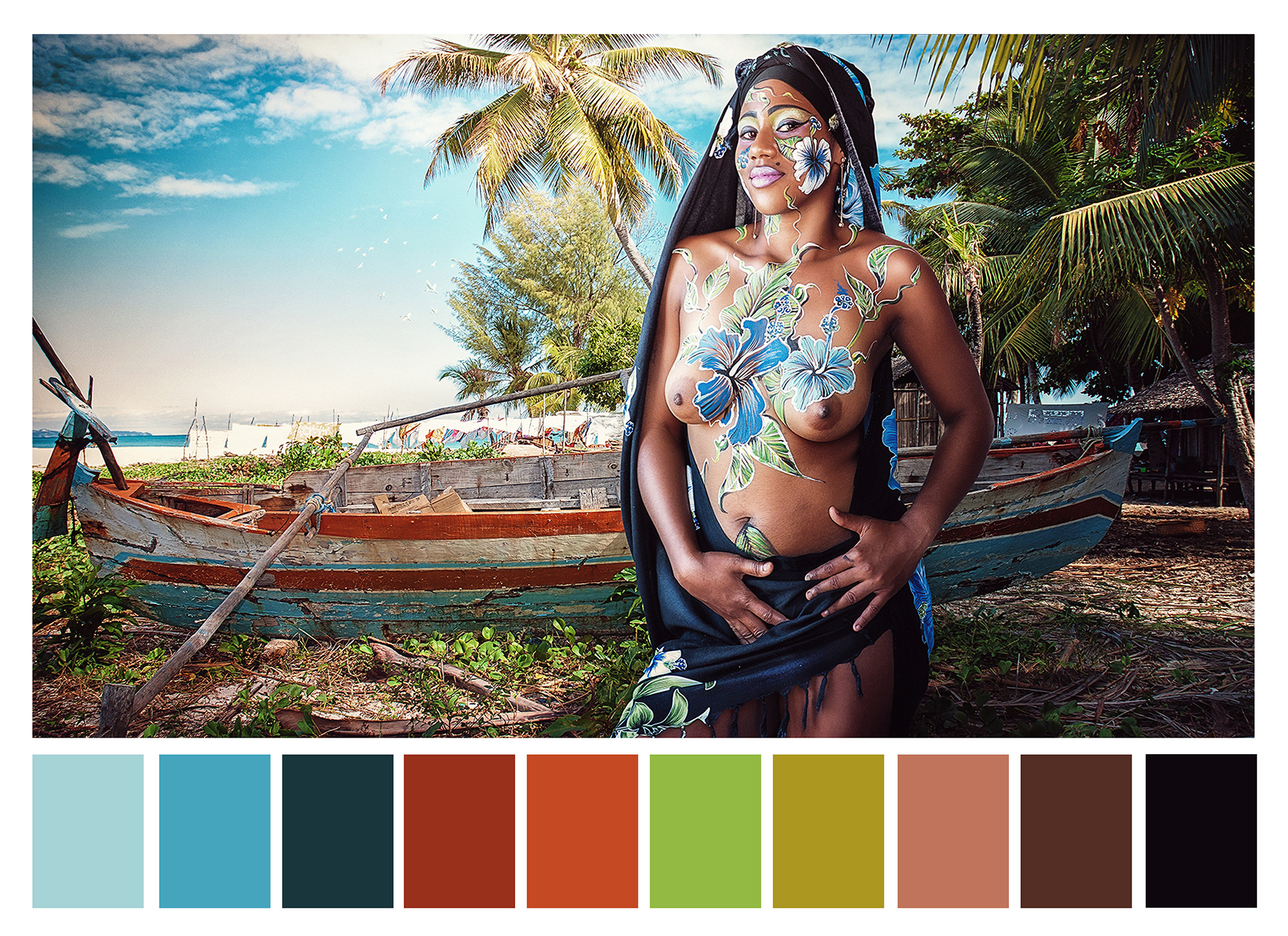
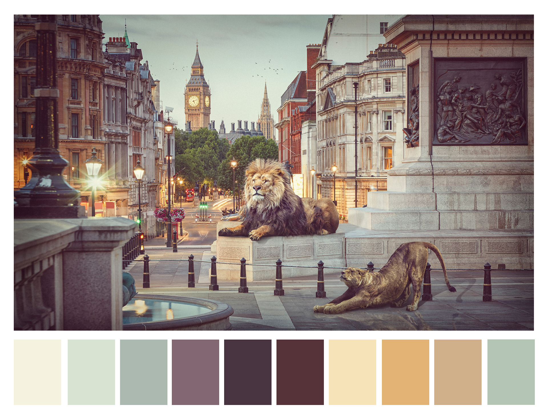
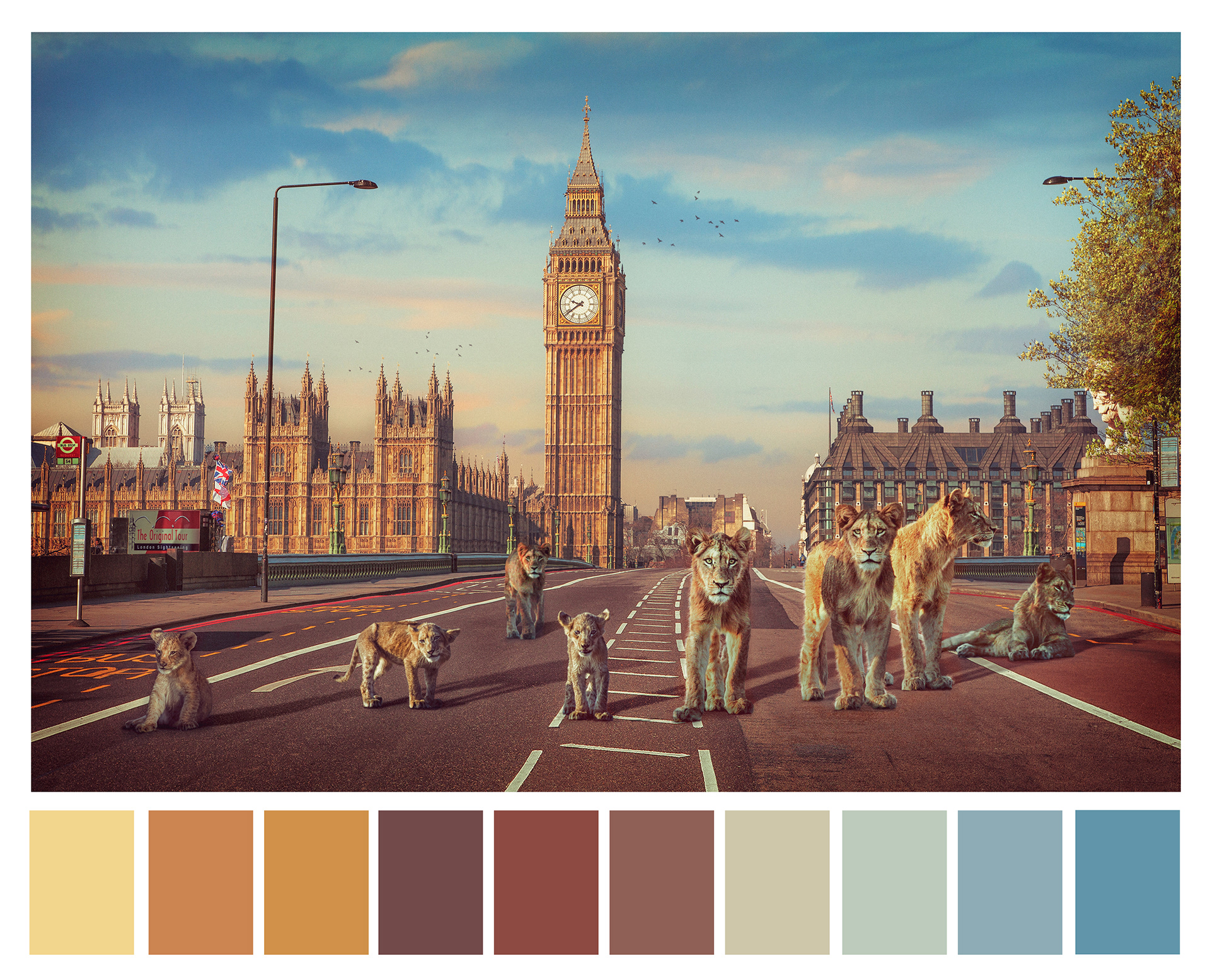
Here are the colour palettes used in just some of my recent photographic work.